Here she is: the Lakeside Country new build home, just north of Greensboro, NC right on secluded Lake Hunt. She fronts a classic and transitional exterior, but don't let that fool you. She really lets her hair down inside.

EXTERIOR PAINT COLOR: SW Dorian Gray
I'll be the first to say that this one took me outside of my design style comfort zone. I love texture, mixed patterns and am not afraid of bold color, but this one was different - in such a good way! I normally lean on neutrals and if I'm adding color, it's moody and earthy. I don't think I've ever used as much blue as I did with this one. And man, was it fun! Take a look at this bright and airy, but full of personality house - and the location could not be prettier!

When I came on board, the house had already been framed so the initial footprint was pretty much set, with exception to where and how to construct some built ins. So from there, it was mostly just selecting everything that needed to go within and outside of the walls. All paint colors, finishes, cabinetry, lighting, hardware, accessories, etc. All the fun stuff! And the client was just the sweetest person, seriously. It made this project that more enjoyable. She came prepared to our very first meeting full of awesome inspo photos and knew the direction she wanted to take things. And from there, we just rolled with it.
Affiliate Disclosure: This post contains affiliate links which I may earn a small commission off of just for your interest, so thank you!
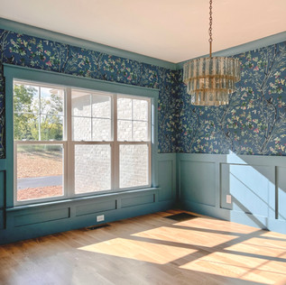
The whole inspiration for the home came from a piece of gorgeous blue wallpaper that she had fallen in love with because it reminded her of the fabric on a sofa from her childhood. She wanted it in the dining room so that it would be easily visible from various parts of the first floor. It's a statement, so let it be seen! From there, we pulled a softer shade of blue to use in the kitchen and on a select few doors to carry the color throughout the first floorm (I'll note all the paint colors at the bottom of this post). Everything else from there really just fell into place.
Back to the dining room real quick and how it came together... we played around with exactly how to use that wallpaper. Should it be just one wall? Should it be the whole room, floor to ceiling? What about the ceiling? Lots of iterations were explored (I love renderings for that!).
PRELIMINARY RENDERINGS TO SHOW VARIOUS APPLICATION OF THE WALLPAPER
We decided to add some modern wainscotting to the lower section of the walls since the wallpaper was very busy. It felt a little too overpowering to cover every inch of wall space. But the molding needed a pop to stay on level with the wallpaper. White molding would have been a disappointing choice. So we opted to go blue. A bold blue on the wainscoting, window trim and crown molding (even though the project Super and paint crew thought we were crazy). And it was totally the right choice!
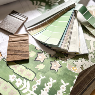
Opposite the dining room is a small powder room. At first, we thought about keeping that space a little more simple so that it wouldn't compete with the bold dining room. Didn't want to over do it. But then we thought, why skimp there? Powder rooms are THE perfect place to have a little more fun and do big, bold things. So we did just that. We went with a busy green wallpaper, but the pattern both contrasts and compliments that of the dining room. I was also sure to coordinate the colors with one another. The green from the powder room pulls nicely from the dining room paper and feels like they belong side by side. To finish it all off, why not paint the door while we're at it? The soft blue works so nicely with both wallpapers and really ties it all together. You'll see that same blue door in a couple other places because why stop at just one?
The kitchen was another fun space. Light and airy was the goal, but she didn't want white. Instead, we opted for a very light greige color on he perimeter cabinets and put a pop of light blue on the island. This allowed for a more white countertop which was definitely the hardest decision out of the entire house. Maybe because there were SO many gorgeous options? But we ended up landing on a quartz with a very natural and realistic marble veining. The background of the slab was enough of a white to add a little contrast against all of the cabinets. We then kept the backsplash tile simple to allow the countertops (And the island) to pop more. The lighting in there might be one of my favorites, too. Gorgeous reeded wood drums with brushed gold touches (Side note: It comes in a couple of different sizes, just FYI 😉). Some elegant brushed gold hardware finishes off the space. I think bright and airy was accomplished, but in a much more fun and inviting way.
Affiliate Disclosure: This post contains affiliate links which I may earn a small commission off of just for your interest, so thank you!
Another thing I totally appreciated about this client was her openness to modern touches with lighting. I mentioned the kitchen island pendants, but the chandelier in the dining room was made of mercury glass. Sort of a modern take on the traditional crystal chandelier. The ceiling fans in both the living room and the master bedroom were also some of the MOST fun ones I've ever used. Even the ones in the guest bedrooms were more elevated than your standard option and it truly makes a difference. So here's my PSA: upgrade your ceiling fans!! It seriously makes a difference.
We continued the fun pops of color upstairs, in a mostly subtle way but definitely went all out in the jack and jill bath which her girls would be sharing. I loved the wallpaper sample when we were planning it all out, but seeing it installed in the space was even more amazing!
We pulled colors from that paper to bring into the connecting bedrooms. But instead of putting it on the walls, we opted for a ceiling accent to provide a different pop. You can see it in the photo above showcasing the ceiling fan. This way, more color and pattern could be brought into the space with things like bedding and drapery without overpowering the room. And those ceiling fans I mentioned above really look amazing against some fun colors!
PAINT SELECTIONS THROUGHOUT THE HOME
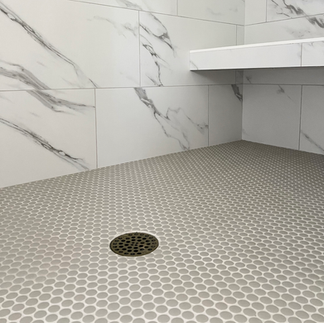
You know I love tile and we definitely used some good ones in this house, but ultimately didn't want the tile to compete with the rest of the bold selections in the home. The kitchen backsplash is one of my absolute favorites. It's a more modern take on a traditional subway tile, providing more movement both with the handmade feel and with the color variation. It's a subtle way to add more interest while still keeping it very simple. My second favorite would be the penny rounds we used in the jack and jill bath. The color is a soft aloe green color and really compliments the wallpaper. I could use penny rounds anywhere! It's classic but can be used with any style. And green? My most favorite color. The master bath is more a softer space. Large 12x24 faux marble porcelain tile covers the floor and shower walls. The base of that tile is a very clean white so we were able to bring in a little color with the cabinets and walls while still keeping it very calm. Through in some more penny rounds in the shower and you've got a very clean and classic looking bathroom.
Affiliate Disclosure: This post contains affiliate links which I may earn a small commission off of just for your interest, so thank you!
I could go on and on, but I'll just leave the rest of the photos here for you to browse. And I hope to be able to add more once the clients get settled in. So I guess I can't really call this a "wrap up". We're just on a hiatus so that they can get moved in before the holidays and then hopefully we'll jump back in to get her all dressed up. There's also an entire lower basement level we haven't even begun to tackle yet, but you can be sure it will have just as much (if not more) personality as the rest of the house. So stay tuned, I have a feeling this project isn't over yet!
























Comments