Project Wrap-up: Oakcliffe Mid-Century Modern Bath Remodel
- Samantha Dunmire
- Jun 28, 2024
- 4 min read
Updated: Nov 9, 2024
Affiliate Disclosure: This post contains affiliate links which I may earn a small commission off of just for your interest, so thank you!
When I first met these clients at their home in Greensboro, NC, I was immediately excited just based on the mid-century architecture. I have a love for that era of design and couldn't wait to dive in. There were clear elements as soon as you walk into the home, but when it came to the bathrooms there was clearly an identity crisis going on. You could tell that previous owners of the home had tried to update those spaces in the late 90's early 2000's time frame based on their finish and material choices. And for the life of me, I could not figure out why they tried to take the mid-century style OUT of those spaces!


So as you can imagine, I was very relieved to hear that my clients wanted to bring the bathrooms back into the era and style of the home. Better yet, they were completely open to my suggestions. Even some bold ones that you'll see below... hint: paint !
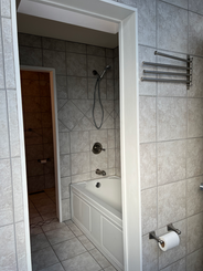
First up, the master bath en-suite. It was in need of more than just a face left. The flow was congested and tight and didn't make much functional sense. There were separate his/hers toilet and sink rooms in addition to a tub and shower room - all crammed into this not-so-big space.
The only thing saving this bathroom was the abundance of light. There was a wall of windows and a skylight which the homeowners wanted to keep and highlight in the design. But the rest of the space needed some serious reconfiguration. So I got to work brainstorming a new footprint.

There would still be plenty of space to give them both a shower and freestanding tub by removing all the individual rooms and backing down to just one toilet. And to consolidate things even more, the idea of a "wet room" came into play where the tub would essentially be in the shower area.

This allowed for enough space to include a large double vanity, which was a big must have on their list. Another request was some dedicated storage space. Ideally, enclosed or hidden (but as you'll see below, we had to make a compromise there).

Part of my process is to create a photo realistic 3D rendering of the design so that I can get a good sense of spatial awareness and to see how all the design elements play together. I'm able to adjust textures and lighting to get it as accurate as possible. This also helps when presenting everything to the client. They don't have to try and visualize it because they're able to really see it. I can even provide a 360 view for them where they can "stand" in the space and look all around. Pretty cool, huh? Click the rendering below (yes, that's a rendering!) and you'll enter the 360 view where you. can look all around the room:

(click the rendered image above to enter the 360 view)
With a design in mind and a floor plan laid out, the crew got to work demoing the space. They took it down to the studs and essentially gave us a clean slate.

But as in most remodels, there were some things that revealed themselves that posed challenges, but we were able to pivot and adjust things to essentially keep the overall design in tact and continue execution.
One of these challenges involved the dedicated storage space. We unfortunately had to adjust things which resulted in some lost square footage on the toilet and storage end of the room. The original idea was to install a sliding door to conceal a recessed storage area, but we did not have enough space to do that. Instead, we chose to keep it exposed and make it more of a design feature.


(rendered image on the left was the original storage idea; rendered image on the right was the adjusted plan)
That way it was still functional but also looked more intentional rather than an afterthought. It also allowed for a large niche in that wall behind the toilet. Such a simple feature but it's one of my faves!

(get the black accent tile here)
From there, things progressed well and our vision came to life. One thing in particular I was excited to see happen was the black ceiling (get a sample of the color we used here). This was a very bold suggestion to the homeowners and they were graciously trusting. It really elevates the whole space. It would have had a completely different feel if they had kept the ceiling white. It was the depth that this space needed! Here's a finished look at it:

Another one of my favorite features is the slat privacy wall. My goal when designing this was to not only provide a bit of privacy (obviously), but to do so in a way that did not close off the space. The last thing we wanted to do was to create separate rooms again - we did not want history to repeat itself! But I also wanted it to feel like it fit within the mid-mod era of style and slat walls were definitely a strong feature during that time period. By keeping it natural, it really popped against the faux marble tile floor, white walls and black ceiling.

And lastly, the combo tub/shower wet area... where do I start? The tile in the shower accent was executed perfectly. And did you notice the details with the linear drain and glass panel? Both were installed seamlessly so that they disappear into the tile. Clean installs like this can really make or break a design.
That tub filler was also an awesome find. It could not be more perfect for that tub!


(get a similar shower stool here)
(get the black accent tile here)

(get the tub filler here)
What were your favorite features? Would you entertain the idea of a bold ceiling in your bathroom? That's the beauty about design - anything is possible, there are no rules. For example, ceilings don't have to always be white.
I can't wait to get my hands on bath #2 for these awesome clients! Can't forget about their sweet dog, too. Look at how handsome he is?!

(get the rug here)
If you need help designing your next project, I'm your girl. Let me show you how awesome your space can look.

Comments